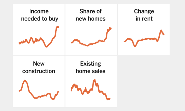
The Housing Market Is Weird and Ugly. These 5 Charts Explain Why.

The Housing Market Is Weird and Ugly. These 5 Charts Explain Why.
Home prices have held up better than expected amid high interest rates. But that doesn’t mean the housing market is healthy.
By Ben Casselman
When the Federal Reserve began raising interest rates in 2022, most economists thought the housing market would be the first to suffer the consequences: Higher borrowing costs would make it more expensive to buy and to build, leading to reduced demand, less construction and lower prices.
They were right — at first. Construction slowed, but then picked up. Prices hiccuped, then resumed their upward march. Higher rates made homes harder to afford, but Americans still wanted to buy them.
The result is a housing market that is different, and stranger, than the one described in economics textbooks. Parts have proved surprisingly resilient. Other parts have seized up almost completely. And some seem perched on a precipice, at risk of tumbling if rates stay high too long or the economy weakens unexpectedly.
It is also a market of stark divides. People who locked in low rates before 2022 have, in most cases, had their home values soar but have been insulated from higher borrowing costs. Those who didn’t already own, on the other hand, have often had to choose between unaffordable rents and unaffordable home prices.
But the situation is nuanced. Homeowners in some parts of the country face skyrocketing insurance costs. Rents in some cities have moderated. Builders are finding ways to make new homes affordable for first-time buyers.
No one indicator tells the full story. Rather, economists and industry experts say understanding the housing market requires looking at an array of data shedding light on different pieces of the puzzle.
